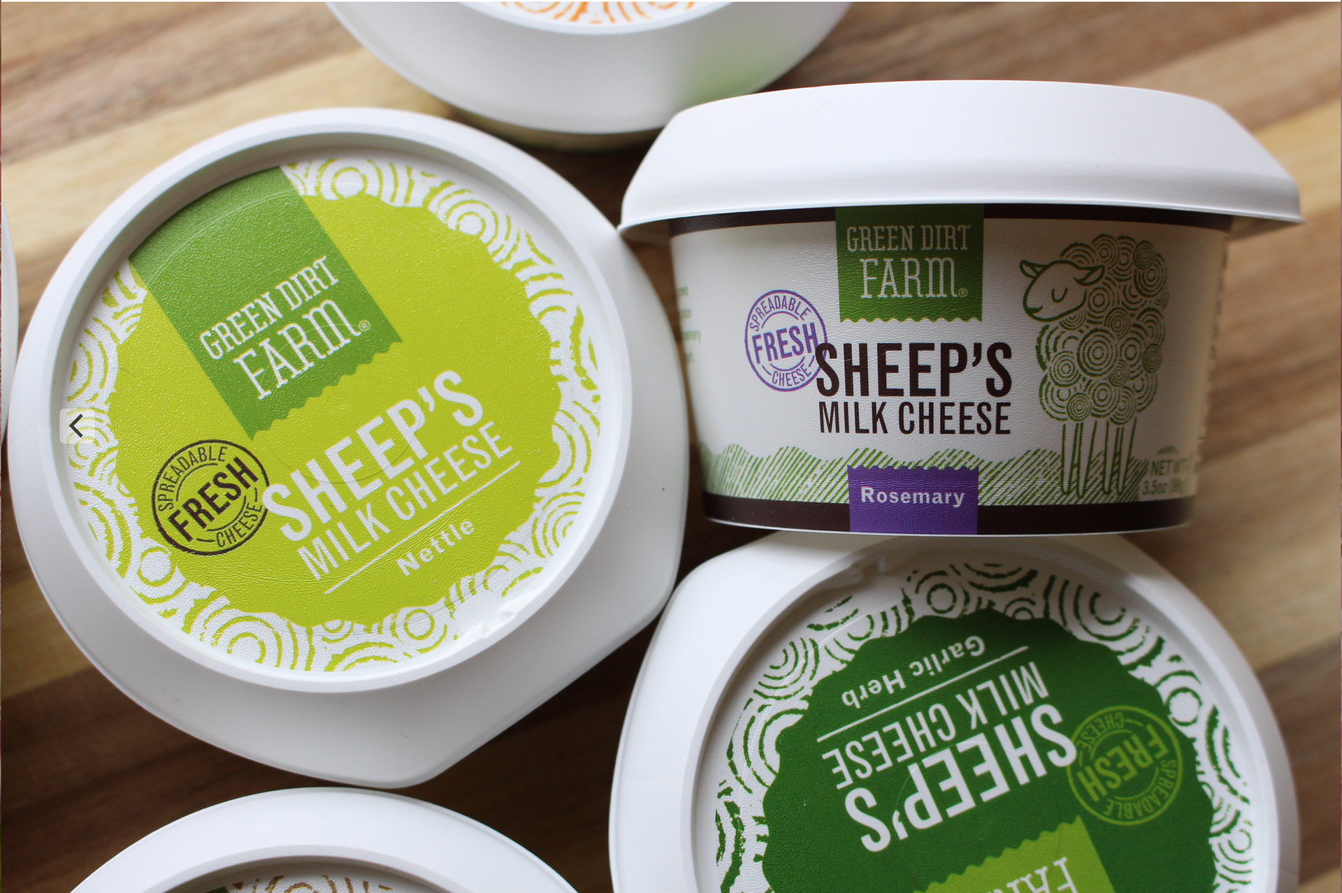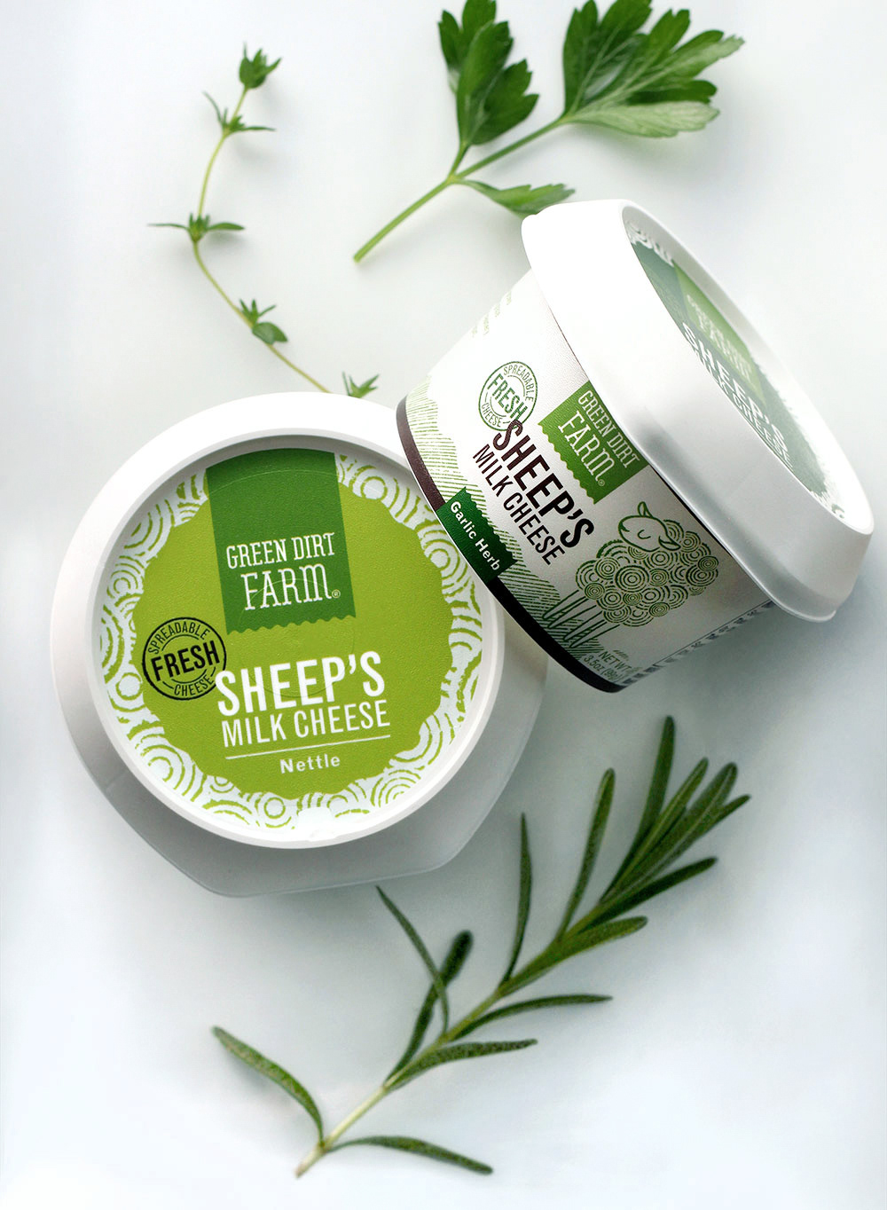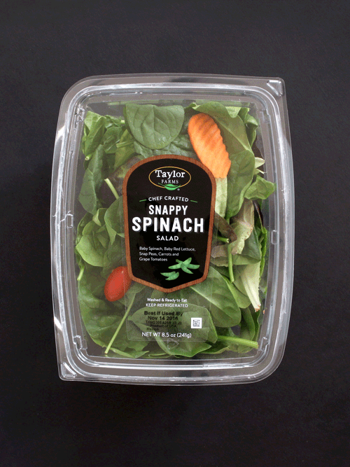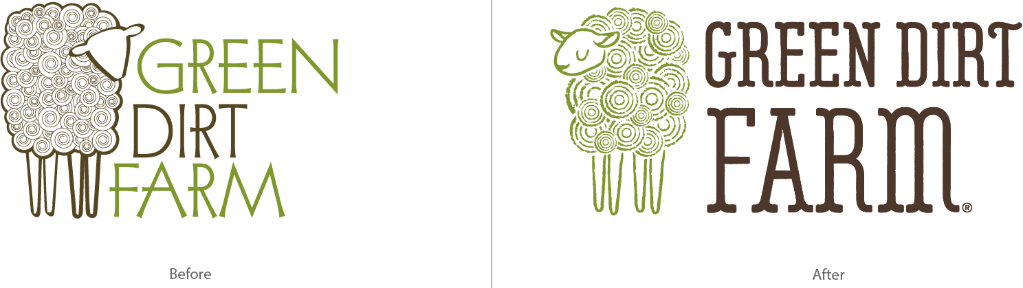
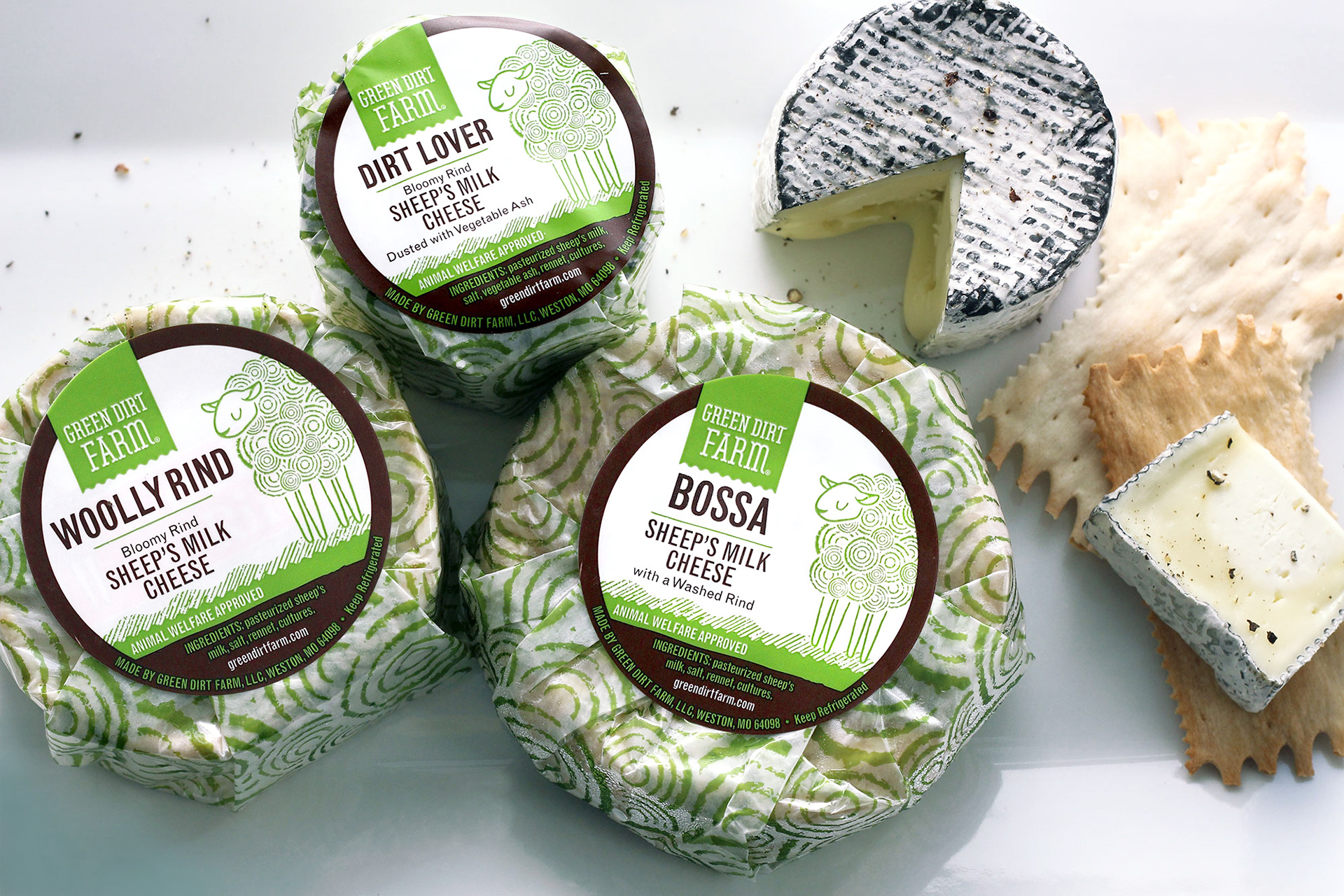
DESIGN EXPLORATION
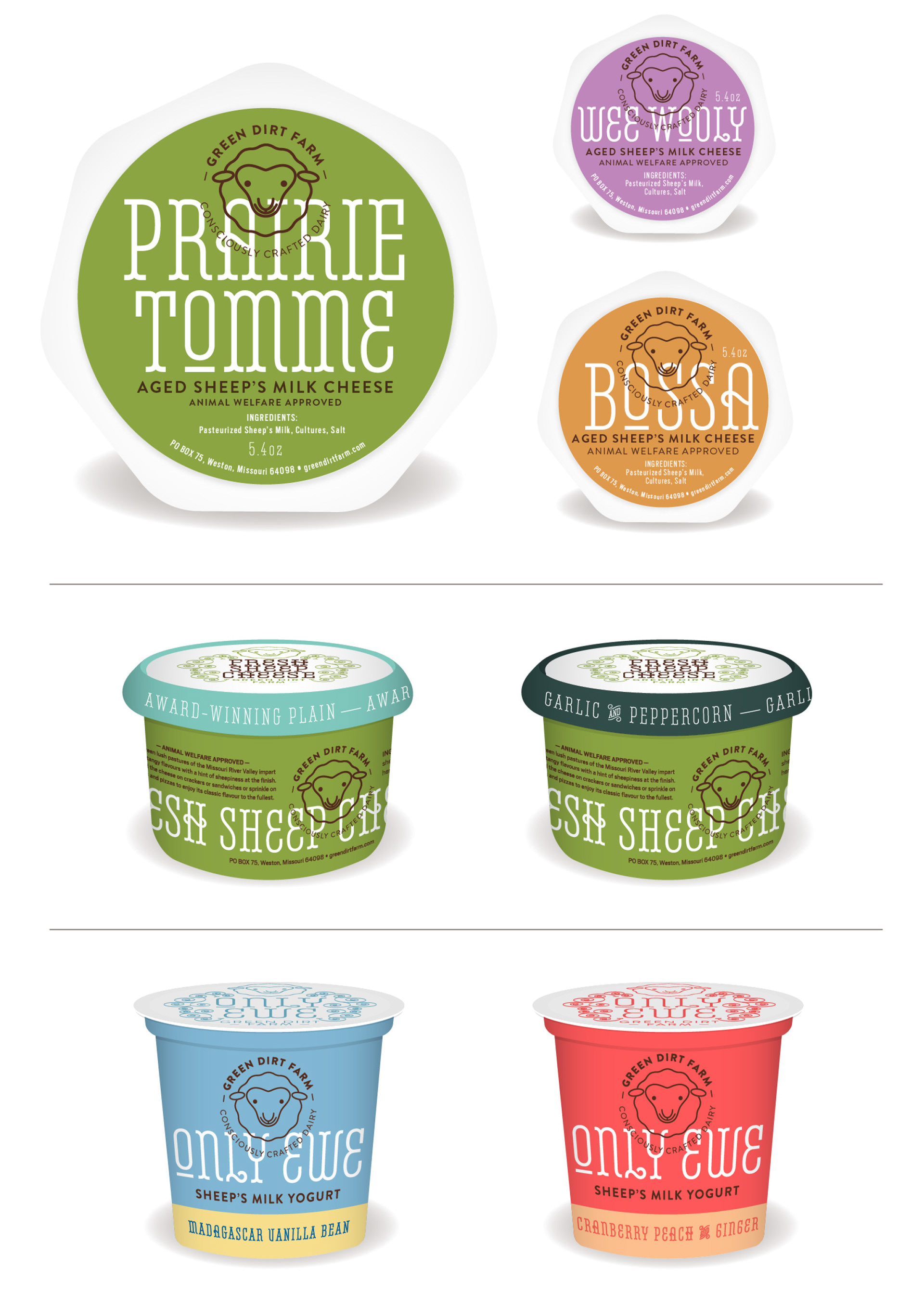
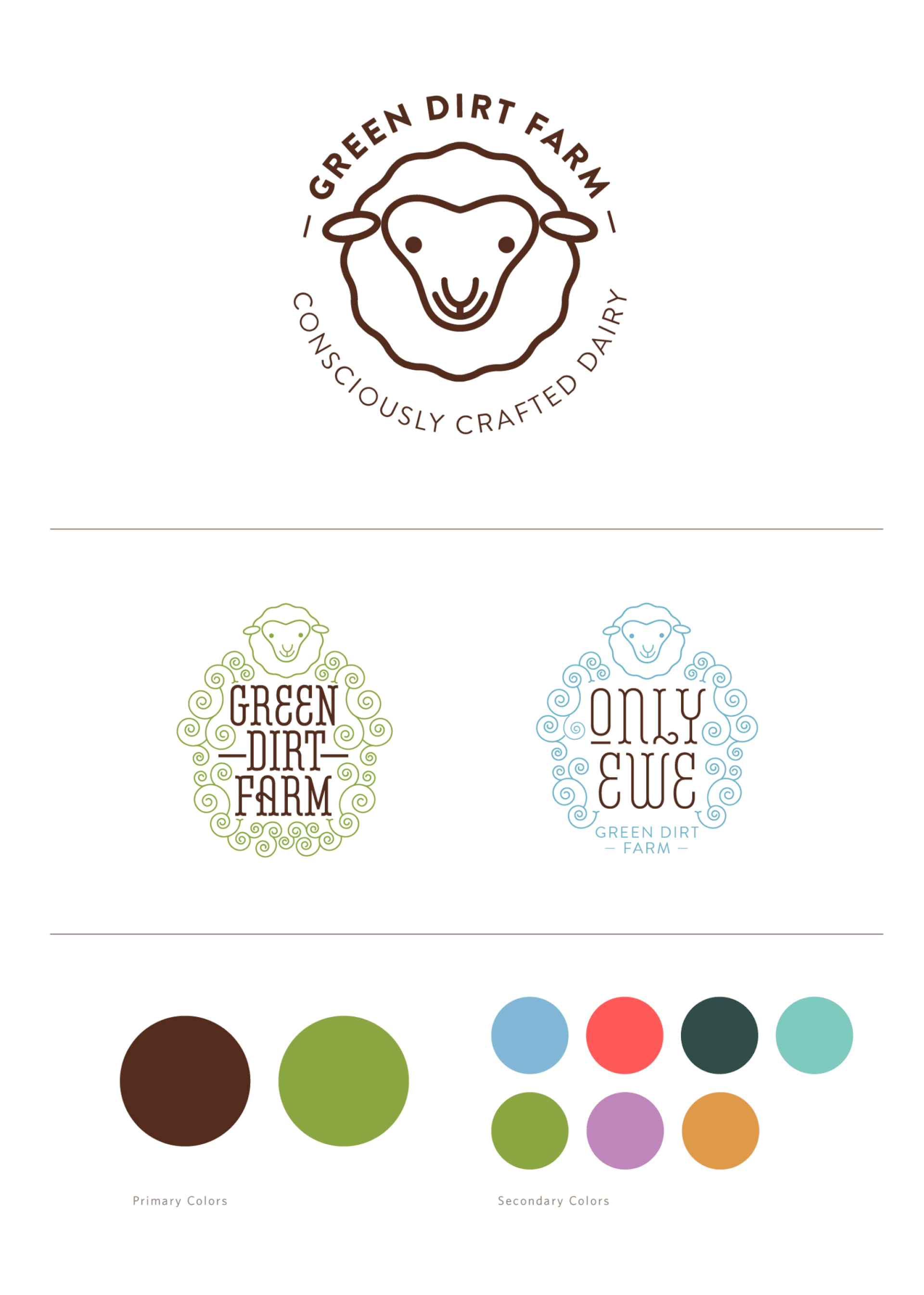
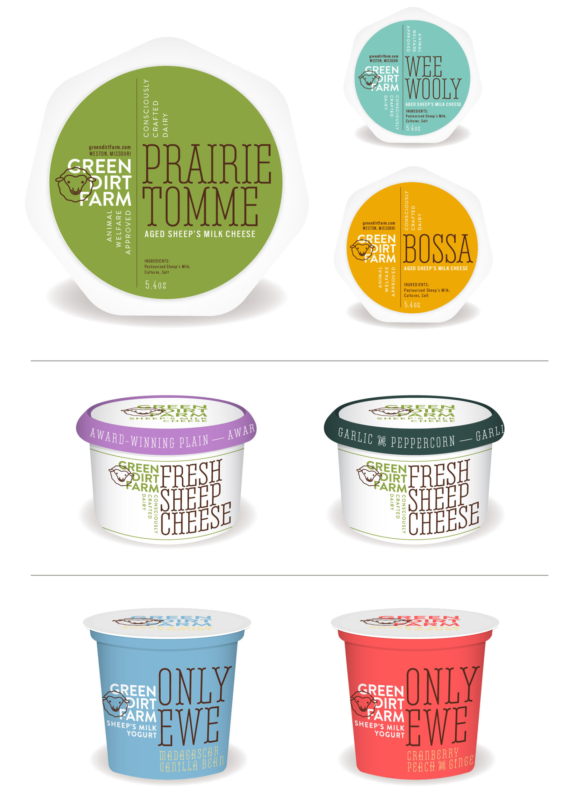
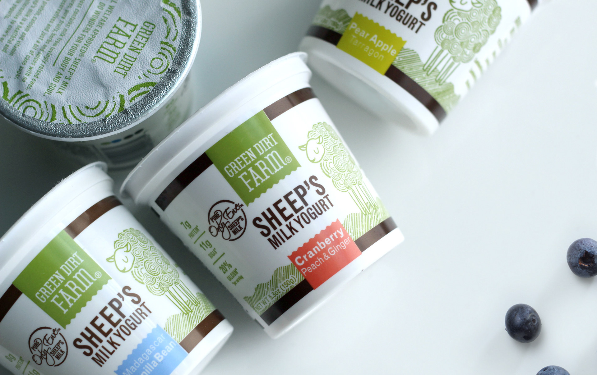
The following are some identity and packaging explorations that I studied. I wanted to transform the mascot sheep into a modern mark that could work as a seal in conjunction with the system. Belleville typeface was selected to maintain a nod to the art nouveau style of the original logo. The curls on this typeface also connected to the Green Dirt Farm's playful personality. In the end the color palette and typeface was carried on to the final design application.