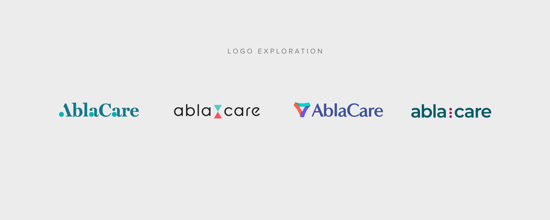

THE PROCESS
The previous identity illustrated an ovarian follicle and egg, as a symbol for fertility. With the new direction, the treatment expanded beyond helping women with fertility issues- so we sought a more universal appeal. We did keep with the teal color which is the color for for PCOS.
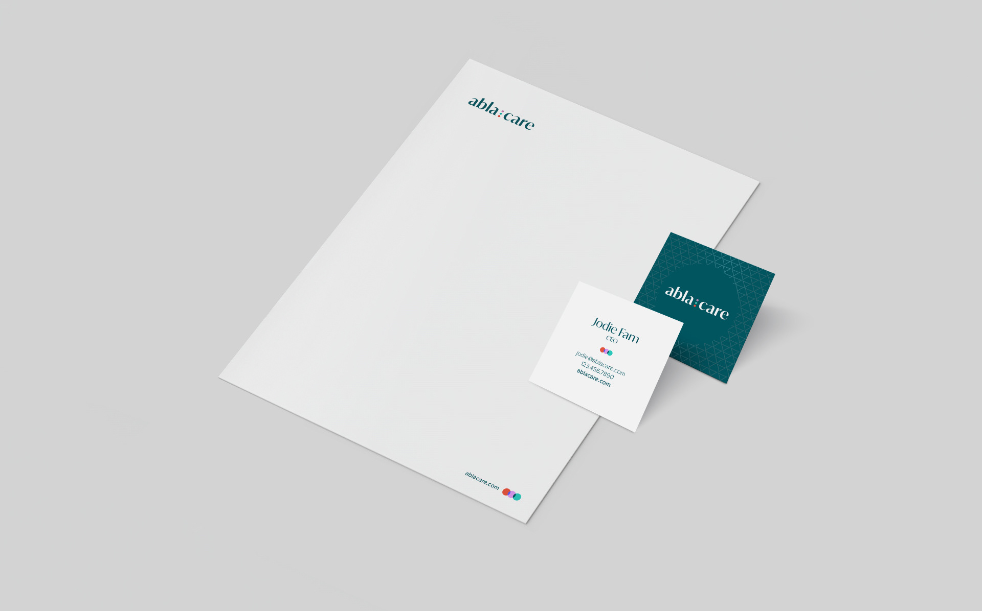
The new brand identity features three dots symbolizing the return to the normalcy provided by the AblaCare treatment. The mark is dynamic and offers fluid executions for social media, digital and print.