


The rollout of the brand was managed by the in-house marketing team at Cerner. We provided brand guidelines that they applied to communications, conference design and more.

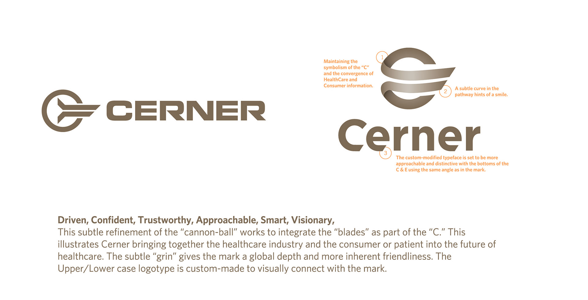
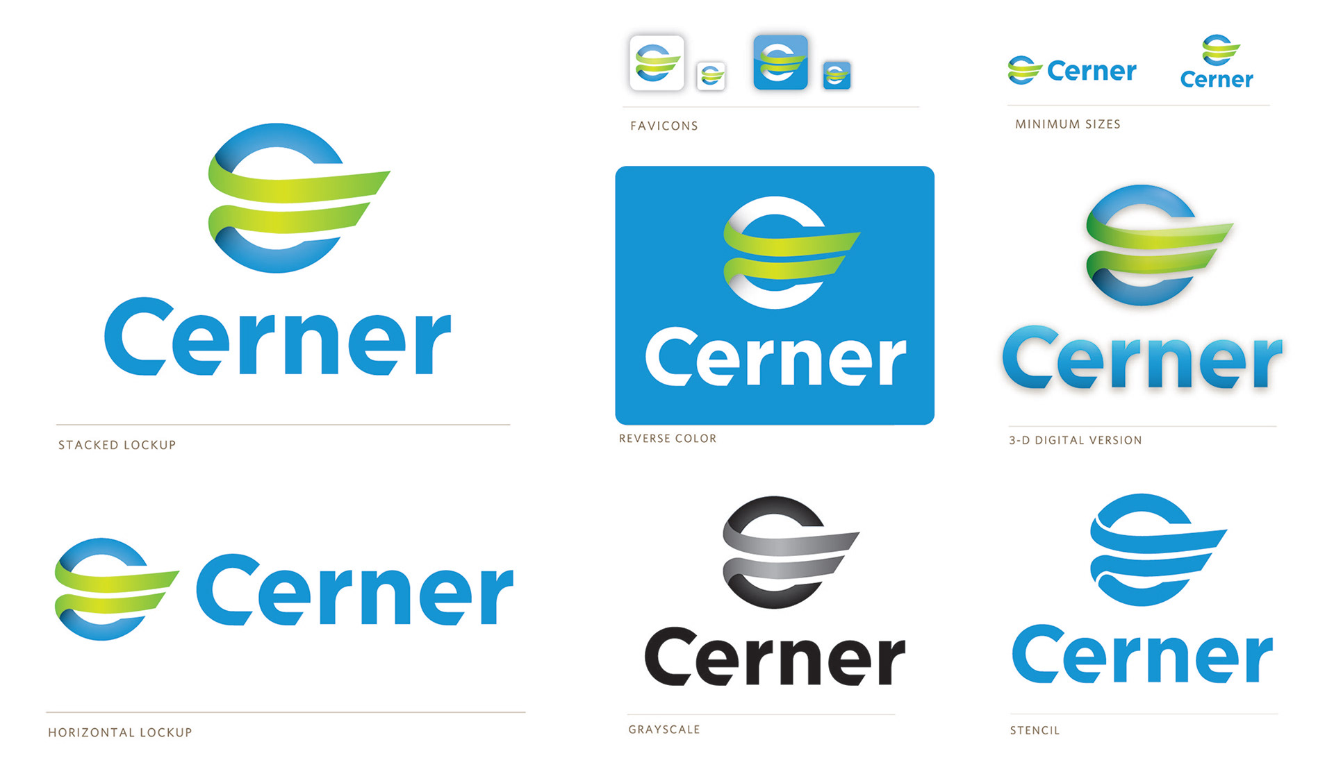
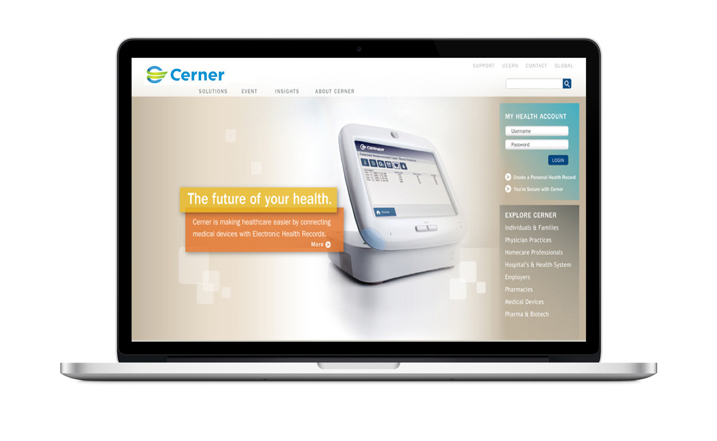
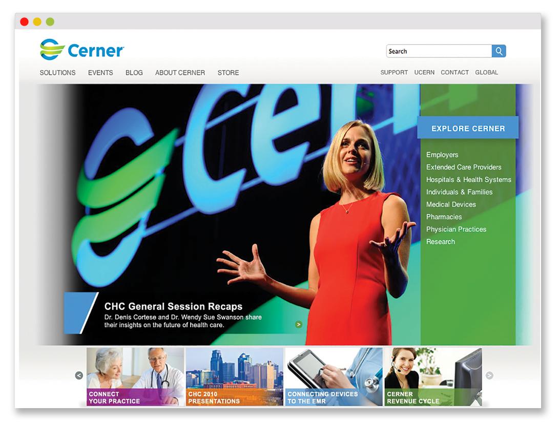
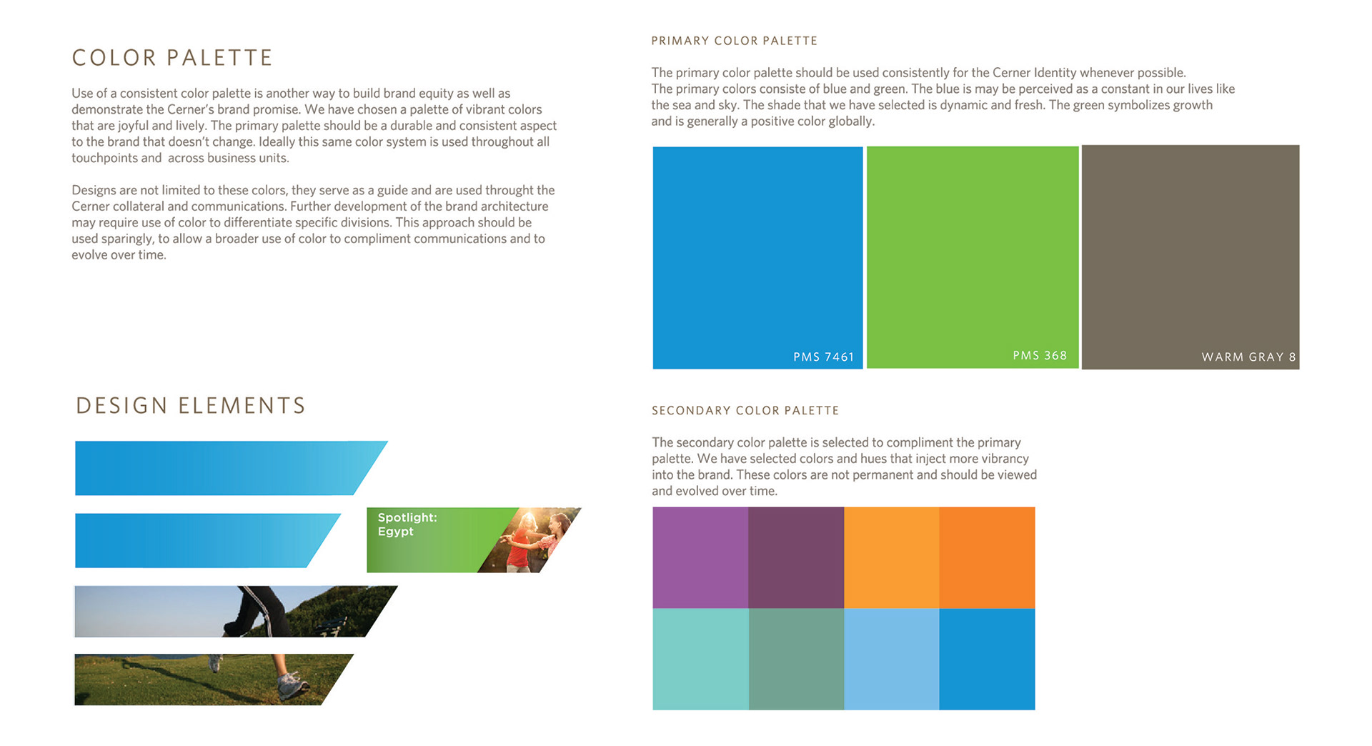
Willoughby helped the Healthcare IT company, Cerner evolve its brand to appeal to a broader consumer audience. For over 30 years, the company had marketed predominately to hospitals but was changing its business to interface more directly with consumers. It wanted a brand that reflected its new strategy. I led efforts as Creative Director. The final outcome was a fresher color palette to make the company friendlier, and a proprietary logotype designed to emulate the symbolism inherent in the original Cerner “cannonball.” This symbolizes the technology industry working with healthcare to provide better solutions for consumers. We also provided visual design for the website redesign in partnership with Happy Cog.