Task
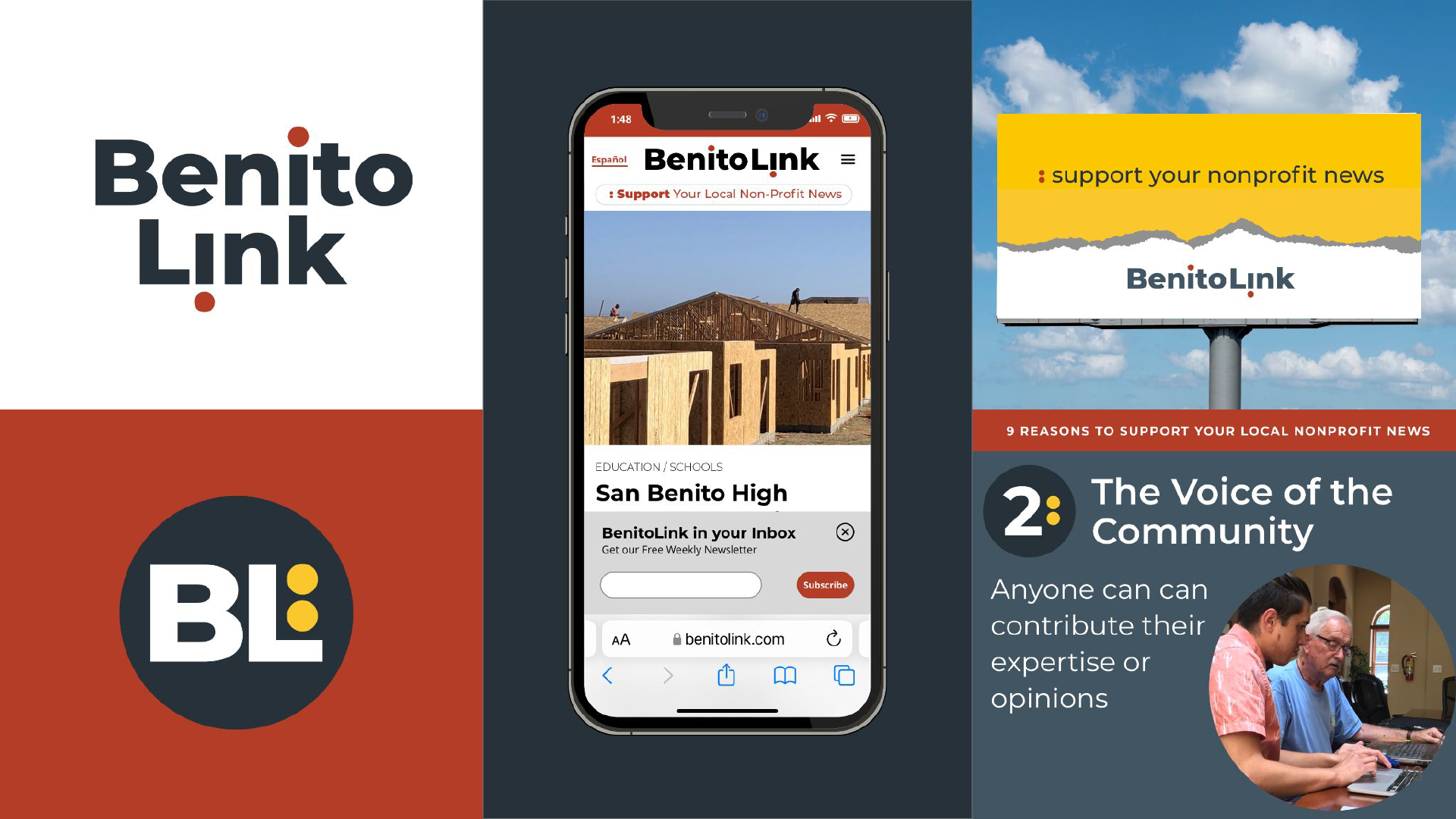
Elevate the existing logo into a complete, accessible brand system and build a cohesive campaign that could increase awareness, encourage reader support, and resonate across a diverse audience that includes long-time residents, Latinx families, new transplants, and younger readers.
Action
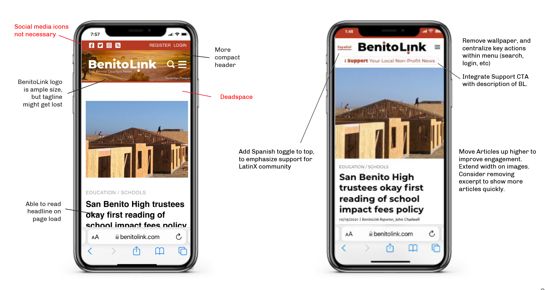
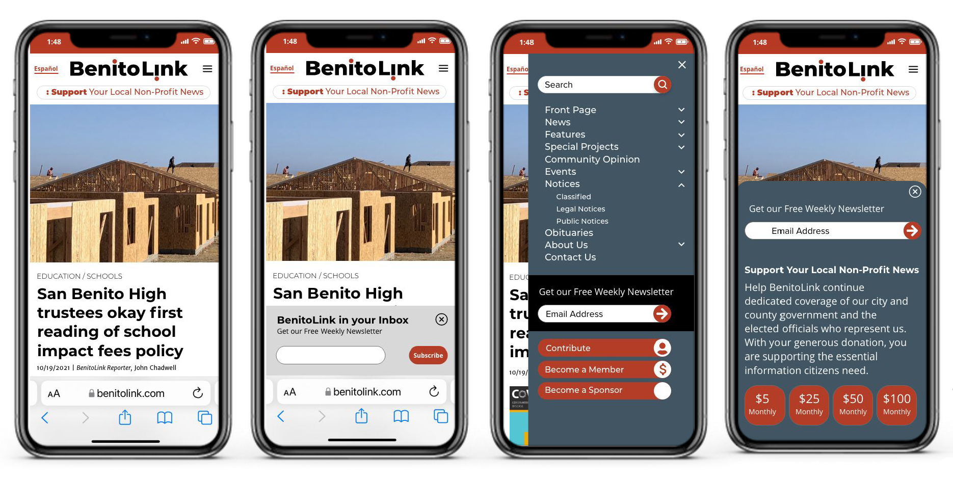
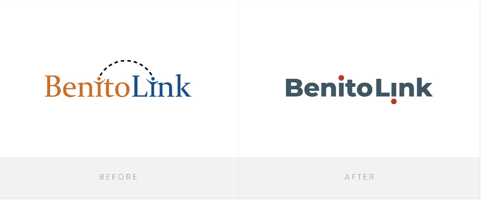
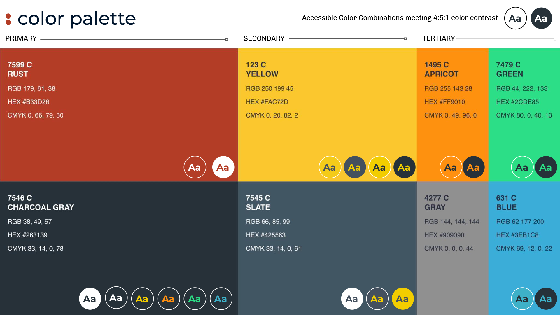
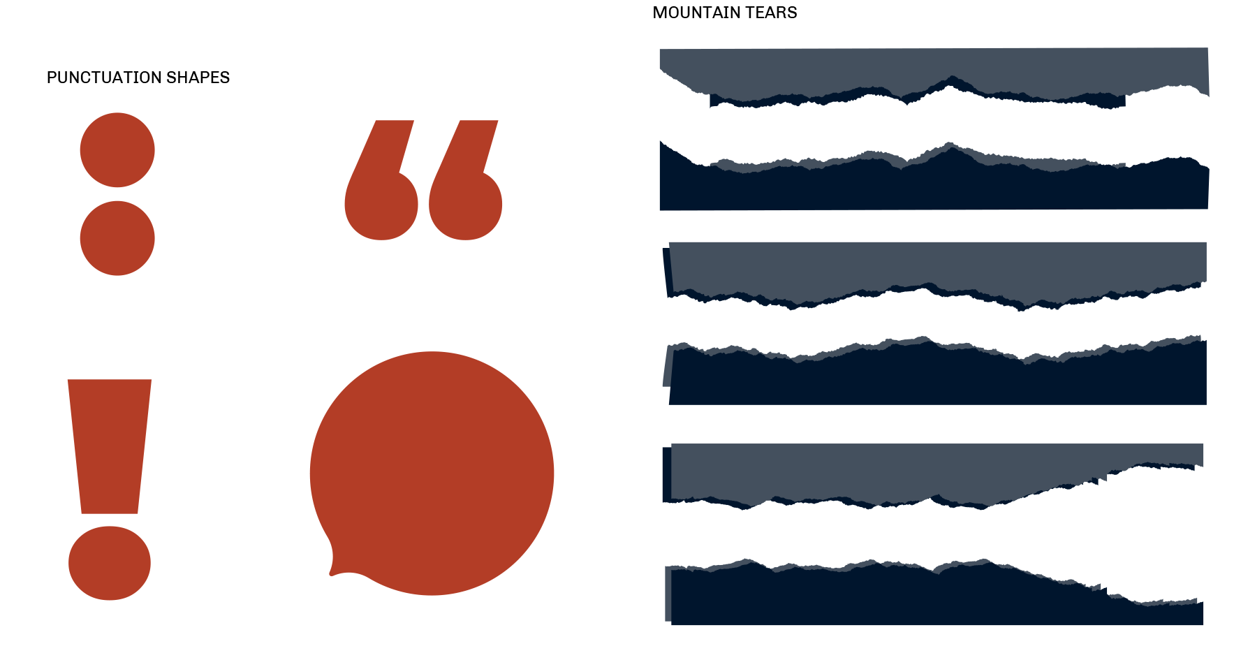
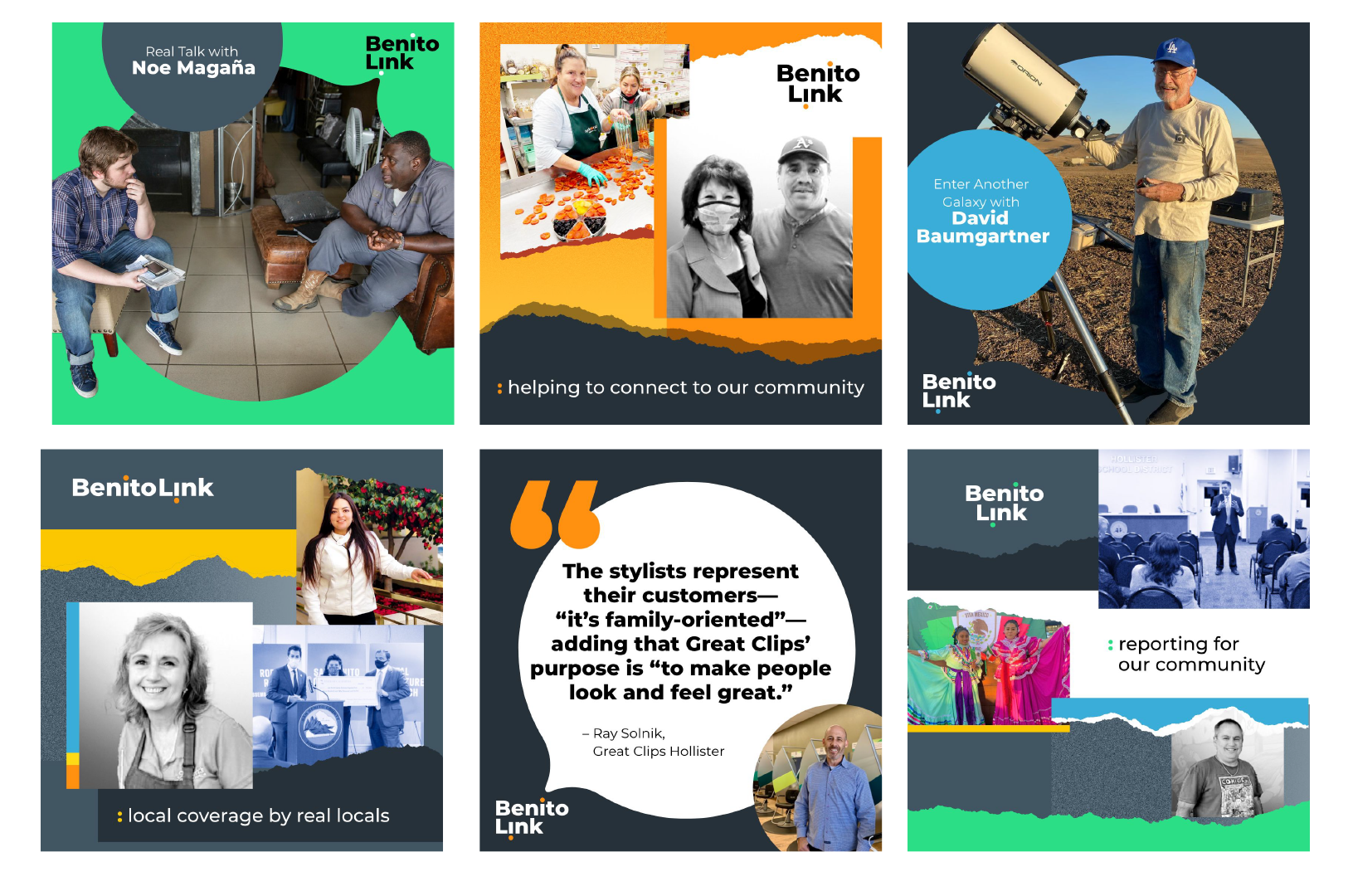
Using the fundraising initiative as a springboard, we expanded the identity into a full visual system—introducing a modern, accessible color palette, refined typography, and a graphic language built around the colon symbol to reinforce clarity, transparency, and “here’s what matters” storytelling. We developed a flexible kit of parts for marketing, social content, and donor messaging rooted in reader-supported journalism. In parallel, I conducted a light UX audit and provided recommendations to strengthen hierarchy, improve accessibility, simplify navigation, and visibly highlight support and subscription pathways for key audiences.
Result
The expanded brand system created cohesion across fundraising, editorial, and social channels, giving BenitoLink the tools to communicate more clearly and consistently. The colon-based graphic device became a recognizable brand asset, enabling unified messaging throughout the campaign. The accessible palette and UX recommendations improved readability and eased navigation challenges for their older and bilingual audiences. The refreshed identity strengthened donor communications and provided a scalable foundation that BenitoLink continues to use today.